Photo credit: Figma / Youtube
The design process behind the deceptively simple artwork for Charli XCX’s career-defining 2024 album, Brat, was recently revealed. The artwork, a blurry green square with lowercase text, was a calculated rejection of hyper-polished digital aesthetics. Designer Brent David Freaney, speaking at Config 2026, revealed that the visual identity centred on the “death of the finished state,” prioritising experimentation over perfection.
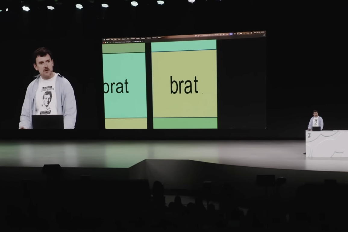
This philosophy mirrors the album itself. Brat was never a polished pop record; it was chaotic, self-aware, and emotionally raw, capturing the messiness of modern nightlife and identity through its visual form. Alongside creative director Imogene Strauss, the team embraced ambiguity and even mistakes, such as the cover’s iconic blur, which was actually an uncorrected low-resolution export error. Rather than fixing it, the team kept the mistake, a decision that feels symbolic in a design culture obsessed with technical precision. By embracing this accidental imperfection, the artwork felt immediate, human, and unconcerned with external approval.
The development of the Brat cover was more intensive than it appeared, involving months of experimentation with colour and typography. This stripped-back approach required significant creative confidence, as the design escaped traditional album packaging to become a cultural phenomenon. “Brat green” established a distinct identity, fueling memes and fashion trends as online communities embraced its abrasive, DIY, and underground energy.
The Brat phenomenon succeeded by trusting audiences to participate. Its unexplained artwork invited interpretation and debate, which fueled its cultural impact. Ultimately, Brat demonstrated that in a world of digital optimisation, audiences connect most with things that feel uncomfortably human and imperfect.